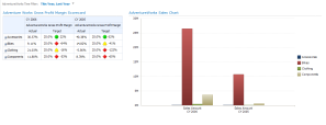
Adding Time Intelligence to the Data Source
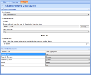
To add time intelligence to your dashboard, the first thing you need to do is to add time intelligence info to the data source that will be using it. To do this you can simply click on the data source, in the data source list, and then click on the “Time” tab at the top. This will bring up all of the configuration options for the time intelligence.
The first option is pretty straight forward; it asks you to pick the dimension that contains the data from the time table. In particular, you need to pick the time hierarchy that you would like to use for the time intelligence in that data source. For example, if your time dimension is named “Date” and you would like to use a fiscal calendar, then you would pick the one that looks like “Date.Date.Fiscal”, “Fiscal” being the name of the hierarchy that represents your fiscal calendar.
The next configuration option asks you to choose a date that starts the year in your calendar, as well as the level that the date is at in the hierarchy, or, in other words, the time subdivision that the date represents. For best results, you should pick an actual date that starts the current year and not some higher subdivision (such as Month, or Quarter). If you pick a higher subdivision you will limit the levels at which you will be able to slice your data. For example, if you pick “January 2010” as the start of your year, then you will never be able to slice by individual days because the “Day” subdivision is one lower in the hierarchy tree. So as a rule of thumb, you should go as deep as your hierarchy allows.
The next thing that you need to configure is the reference date that the date in the previous step refers to. For all intents and purposes, this date should simply be the same date that you chose in the previous step. However, if you picked a time period at a level higher than a specific day then you need to pick the first date in the period that you specified in the previous step. For example, if you picked “January 2010” in the previous step then you should put January 1st, 2010 as your reference date. It is also possible to transpose a period in the past to be represented as the present with these settings. All you need to do is pick a date in the previous setting that represents the same day as your reference date but in a time period in the past. For example, if your reference date is January 1st, 2010 then you could pick January 1st, 2006 to view all of 2006’s data as if it was the present. This actually gets confusing when you incorporate it into your dashboard because a calculation for “today” would actually be todays date but in some period in the past. So unless you’re working with purely legacy data, you should always pick a date in the current time period.
Finally, you need to specify the time member associations in the bottom panel. This step is simply a matter of mapping each level in your time hierarchy to its corresponding time subdivision. If the attributes in your time hierarchy were all named appropriately then this is really just a matter of picking the name in the drop down that is the same (or similar) to each hierarchy level.
Creating a Time Filter
The next step to adding time intelligence to your dashboard is to create the actual time filter that will be placed on your dashboard. This time filter will be the controller used to select the desired time period to be displayed.
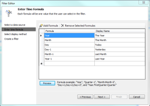
To create a filter you simply need to right-click the PerformancPoint Content list in Dashboard Designer and go to New –> Filter. From here, pick the Time Intelligence filter and click “Ok”. In the next step you need to add the data source that now has the time intelligence configured. You can add multiple data sources to this list, however you will only be able to use one at any given time. The next step asks you to enter all of the time formulas that you would like to make available to your users. These will be the time periods that the user will have to choose from when they go to your dashboard. Some possible formulas could be “Day” (today), “Day-1” (yesterday), “Month” (this month), “Year-1” (last year), and so on. These formulas will automatically bring your user to the specified time period relative to that day’s date. Once you have all of your formulas created you can click the “Preview” button to see if they were created correctly. All of the values returned in the preview should be correct according to today’s date.
In the final step, the wizard asks you to select the display method that you would like for the time filter. Since this is simply a list of formulas, the “List” option and the “Tree” option will be pretty much the same. However, if you want to be able to compare “Today” to “Yesterday”, for example, you can pick the “Multi-Select Tree” which will allow your user to pick as many periods as they like for a side by side comparison. To get the side-by-side comparison to work properly it will require a little bit more work however, so I will get in to that in the next section.
Once the time filter is setup there is only one more step to having time intelligence in your dashboard, and that is the process of hooking up the time filter to the rest of the PPS objects on your dashboard. There are two types of objects that can consume your time filter: a scorecard and an analytic chart. Both of these require slightly different setups so I’ll go through each of them individually.
Scorecard
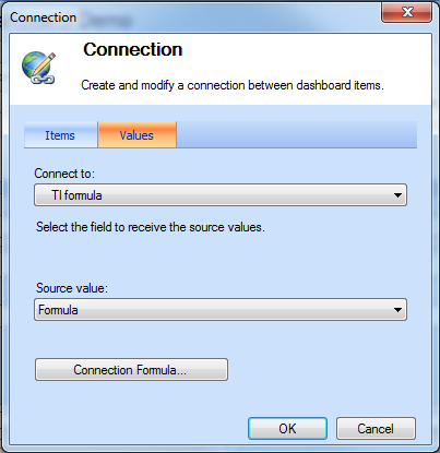
On your dashboard find, or create, a zone to put your filter into and then drag and drop it into that zone. Assuming you already have your scorecard on your dashboard, you are ready to hook it up to the time filter! To do this, simply drag the “Formula” field from the time filter and drop it on to the scorecard’s zone. This will automatically create a connection between the two objects and bring up a connection configuration dialog. In this dialog, under the “Values” tab change the “Connect To” dropdown to “TI Formula”, and click “OK”. This TI Formula is a built-in “hook” for scorecards. It allows you to connect to a time intelligence filter without messing around with the scorecard itself. Once you deploy your dashboard you will be able to use the time filter to view the scorecard stats for a particular time period. The filter works asynchronously so that as soon as you change the value in the filter, the values in the scorecard will adjust to that time period without making the user refresh the page.
If you picked the multi-select tree as your filter type then you need to set up your time intelligence a little differently. In the editor for your scorecard you’ll need to add the time hierarchy that your time filter is using, to one of the axis in your scorecard. For example if you want to compare time periods side-by-side, in columns, then you simply need to drag and drop the time hierarchy above your columns. When it asks you to select the members you would like to use, select “All Periods”. This is because we want the time filter to control the members that are displayed, not the scorecard. In the dashboard editor, drag and drop the “Member Unique Name” field from the time filter on to the scorecard’s zone. In the connection configuration dialog, change the “Connect To” dropdown to “All Periods” under Column Hierarchies. If you previously had something connected to the TI Formula of the scorecard, you will have to delete this connection for the multi-time-period comparison to work.
Analytic Chart
The analytic chart requires a few more steps to setup because it doesn’t have the same TI Formula to connect to. The way to connect time intelligence to your analytic chart is through the “Background” filter of the analytic chart. To add a background filter you need to open your analytic chart in the editor window and then simply drag and drop the time hierarchy that the time filter is using on to the “Background” panel. This “Background” filter is basically your hook in to the WHERE clause in the MDX query. Putting a hierarchy here allows you to attach filters to the data displayed in the chart without changing the two axes. This means that you can transparently filter your data by some “objective” hierarchy that is not explicitly shown in your chart.
Once this is done, you just need to hook up the analytic chart to the time filter on your dashboard. To do this, open your dashboard in the editor and drag and drop the ”Member Unique Name” field on to the analytic chart’s zone. In the connection configuration dialog box change the “Connect To” drop down to the name of the time hierarchy that you put in the “Background” filter. Re-deploy the dashboard and you then have complete control over the time period that you view for the analytic chart.
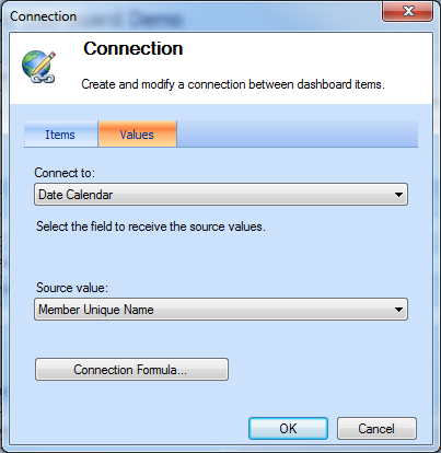
This is what your connection settings should look like when you connect your analytic chart to your time filter.
If you selected the multi-select tree as the filter type, then this setup will still work, but you will only see the total of your measure for ALL the time periods that you chose. If you want to see a side by side comparison you simply need to open your analytic chart in the editor and put the time hierarchy under the axis that has your measurement instead of putting it in the background filter. You will then see that the chart will split the results into the chosen time periods.
Sample Dashboards
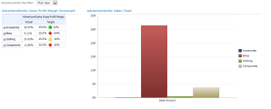
Here are two screenshots of what your dashboard could look like when you add time intelligence using either the single-select drop down filter, or the multi-select tree filter.
